
AQUA ESSENCE PRODUCT IDENTITY
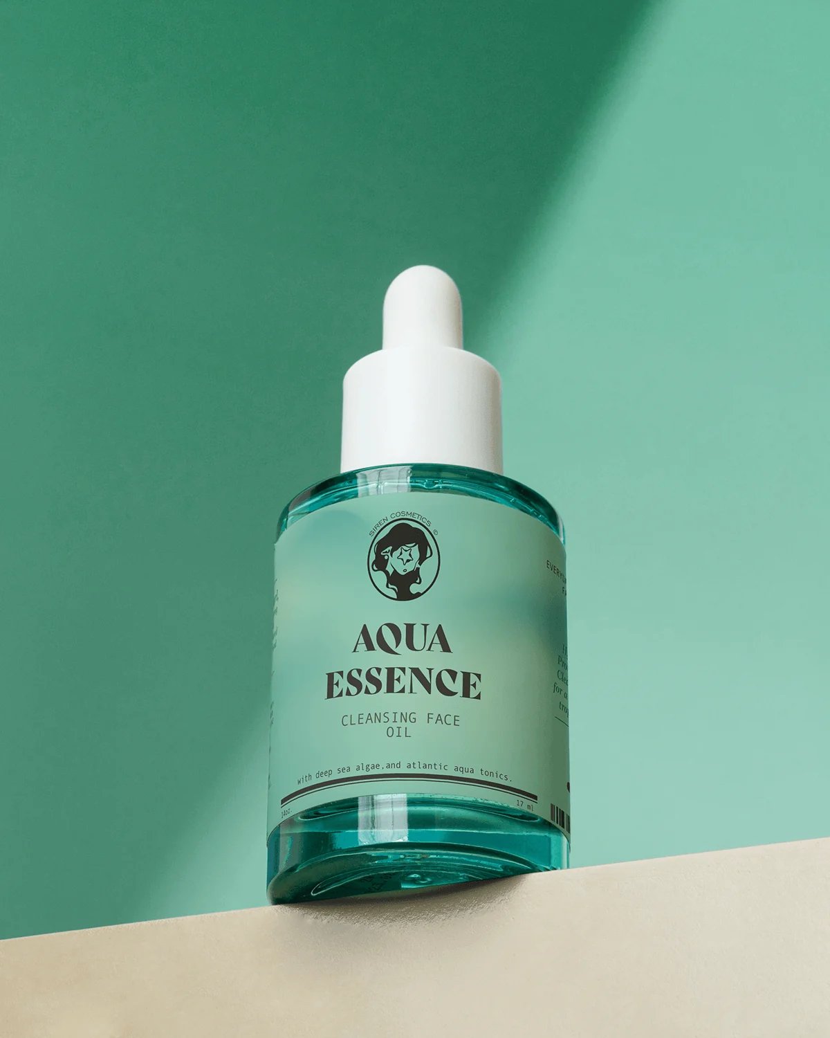
A premium skincare packaging direction for Aqua Essence, built around a clean aquatic palette, editorial typography and a focused shelf-ready label system.
Project Overview
Aqua Essence is presented as part of the Siren Cosmetics product family. AWE’s portfolio work explores how a focused sub-product identity can sit within a wider brand while still feeling distinctive enough to lead its own campaign.
Challenge
The packaging needed to communicate freshness and premium skincare while keeping product naming, product type and supporting information legible on a compact cylindrical label.
Brand Strategy
The direction uses “Aqua” as the strongest verbal cue and reinforces it with sea-green colour, transparent product presentation and restrained black typography.
Creative Direction
A soft aqua field, high-contrast wordmark treatment and minimal rules create a modern apothecary-meets-editorial look. The parent Siren mark remains visible without competing with the product name.
Packaging Design
The label hierarchy separates brand, product name, product category and supporting copy so the bottle reads clearly in close-up photography and digital merchandising.
Final Experience
The final presentation gives Aqua Essence a clean, premium visual identity that can extend into product photography, web merchandising and campaign assets.
Outcome
This case study documents the visible brand and packaging design work only; no unsupported product-sales or market-performance claims are included.